These past 7 weeks have certainly flown by but I’d be lying if I said that each moment of it was a breeze. While I understand in general how to process graphs and data, it was a learning curve to learn how to be a better researcher when it came to understanding how and why information can be manipulated to tell a biased narrative and of course, how to use tools like Tableau to create compelling, data-driven stories.
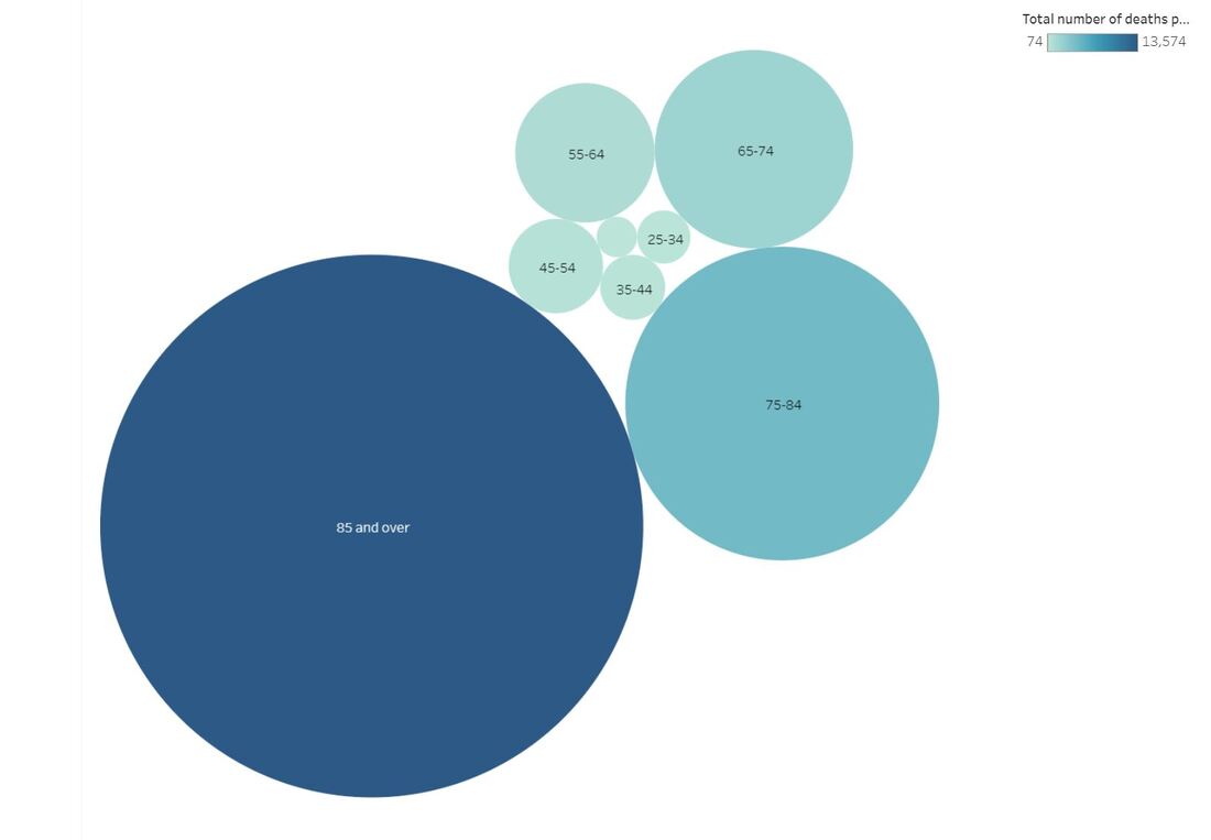
Perhaps the most interesting part of this course for me was learning the various trends through all the different data sets I collected. I collected information on the leading causes of death in the U.S., the number of child marriages per capita on a national level, and how the wage gap can be broken down by sex, race, education level, and occupation. I also learned that data can indeed be beautiful, as indicated by the many, various data story submissions that the Information is Beautiful organization highlights each month. Some of the learning components that stand out to me include being able to identify the most important pieces of information in a data set, how to best represent them, and of course, the importance of pursuing accuracy - all skills that translate well into any job. Though I’ve learned a lot in such a short amount of time, I think I’d be happy if I continue to work in environments where I never have to touch Tableau again. But if I do, at least I’ll have rudimentary knowledge of how to work it :) Now onto my data story… It’s not the happiest topic, but I wanted to cover what the primary health-related causes of death were among those 15 and older in the United States across 2016 and 2017. The information I gathered was provided by the CDC. There were three main areas I studied - the number of deaths in both 2016 and 2017 by disease, age range, and sex and race. (If anyone wishes to see an Excel spreadsheet of my data, it is provided here: cdc_2016_and_2017_mortality_in_the_us.xlsx Of course, CDC provided much more information than these three areas, but for the sake of simplicity, I wanted to focus on the key points that I did. Although the information was pulled from a study that covered just two years, we can identify the diseases and specific demographics we need to focus on in hopes of lessening the impact of serious conditions like Alzheimer’s, either through healthier living and/or improved access to care. Please peruse my Tableau data below to view the full data story, or use the link here to go to Tableau Public directly: https://public.tableau.com/views/Module7FinalProject/U_S_MortalityRates2016and2017?:embed=y&:display_count=yes&publish=yes&:origin=viz_share_link 
0 Comments
Leave a Reply. |
 RSS Feed
