 I don’t consider myself a “math person,” but with a careful eye, I can differentiate between a good graph and a not-so-great one. 1. Take, for example, the following pie chart listed on “WTF Visualizations,” a collection of data visualizations that meant to inform audiences but didn’t quite deliver. 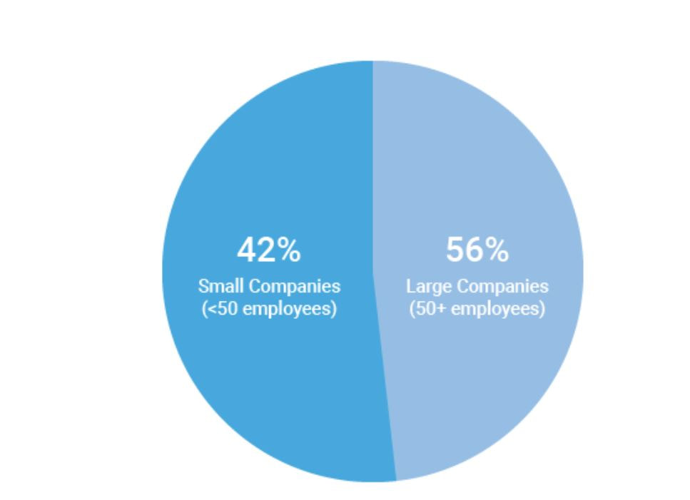 At my workplace, I’m responsible for reporting on human resources trends, employment laws, and best practices on behalf of one of our clients. That being said, I find data and statistics related to these topics fascinating but with this particular chart, I can’t tell what I’m supposed to be gleaning, information-wise. Are U.S. companies mostly large companies at 56% while small companies comprise 42% of national businesses? Or do these numbers apply to a specific state or region? Or are 56% of U.S. workers employed at large companies while 42% work at smaller businesses? Not to mention, 42 and 56 does not add up to 100, nor should 42% represent a bigger slice of the pie than 56%. A common problem when it comes to chart creation, is clutter, according to Tableau experts. The bigger problem in this case is the lack of context – there’s not enough information to generate clutter! The creators of this pie chart would’ve done well to follow the advice of “Steal Like an Artist” author Austin Kleon (it’s a great little book, by the way). Kleon’s advice is to glean inspiration from great creators (or in this case, visualizations), and replicate some of the strategies that would fit well into one’s own creation. The following visual from the Virginia-based Small Business & Entrepreneurship Council shows a bit more information than the pie chart above, and utilizes creative ways to outline data related to women-owned businesses: 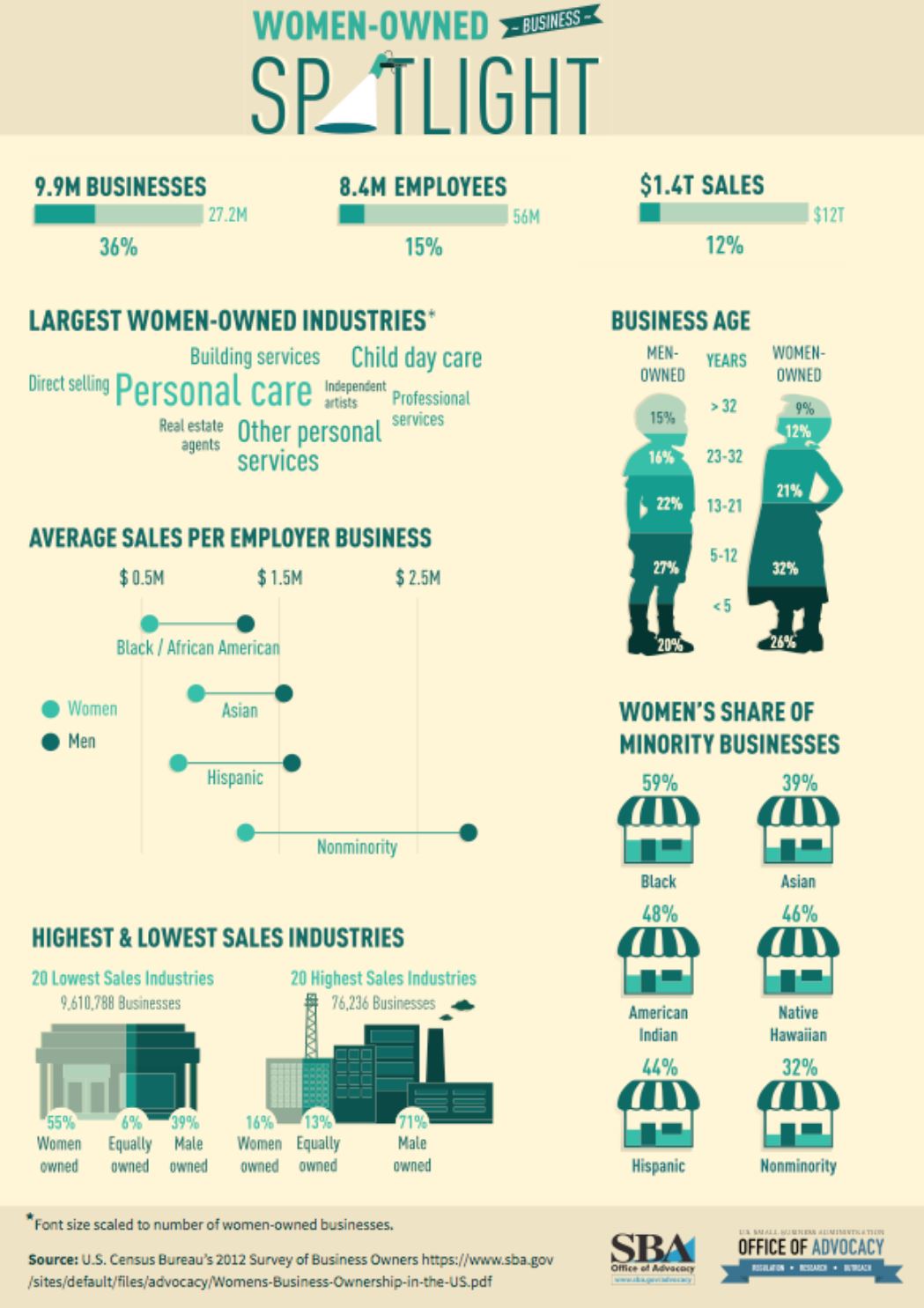 Here, we’re at least given context as to what the percentages are related to – of the 27.2 million businesses in question, 26% percent are women-owned, while 15%, or 8.4 million employees in question are female. A bonus – the percentages listed in the “Business Age” section each add up to 100, and the images used (silhouettes of a man and woman) are far more compelling than a pie chart. 2. I found the following chart problematic for different reasons. It’s unfortunate that someone at AP thought it was good enough to publish as is… 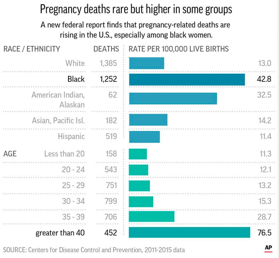 There are a few logistical elements that are hard to ignore with the above graph. Firstly, the color gradients seem to serve no purpose – if there was a color scale that served as a key to indicate the differences in the number of pregnancy-related deaths (i.e. lighter blue hues for less deaths, darker blues for more), that would make more sense. Secondly, I feel that the bars shouldn’t be so staggered as they are. Perhaps it’s just a matter of opinion, but I think that they should be ordered by either greatest to least or least to greatest deaths per 100,000 live births. The way it is presented now, my eyes dance all over the page. Thirdly, the values represented by each bar are terribly inconsistent – why are 32.5 and 76.5 so similar in size, along with 42.8? Here is a more effective graph (found on the CDC website): 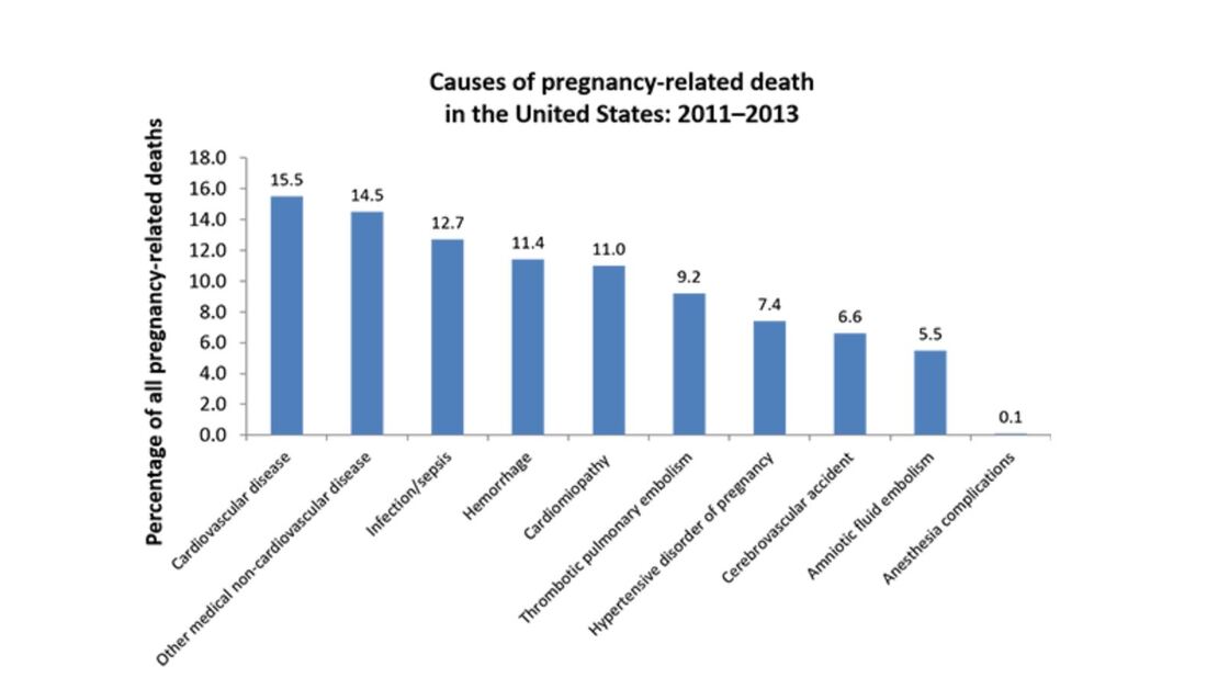 This graph doesn’t present the exact same information as the first, but it does avoid the unnecessary color scale, and the causes of pregnancy-related deaths or ordered from highest percentages to the lowest. Is it the most visually compelling graph? Perhaps not. But it avoids clutter and unnecessary bells and whistles, and the use of color is simplified. 3. With this chart, we run into the issue of problematic bar graphs again: 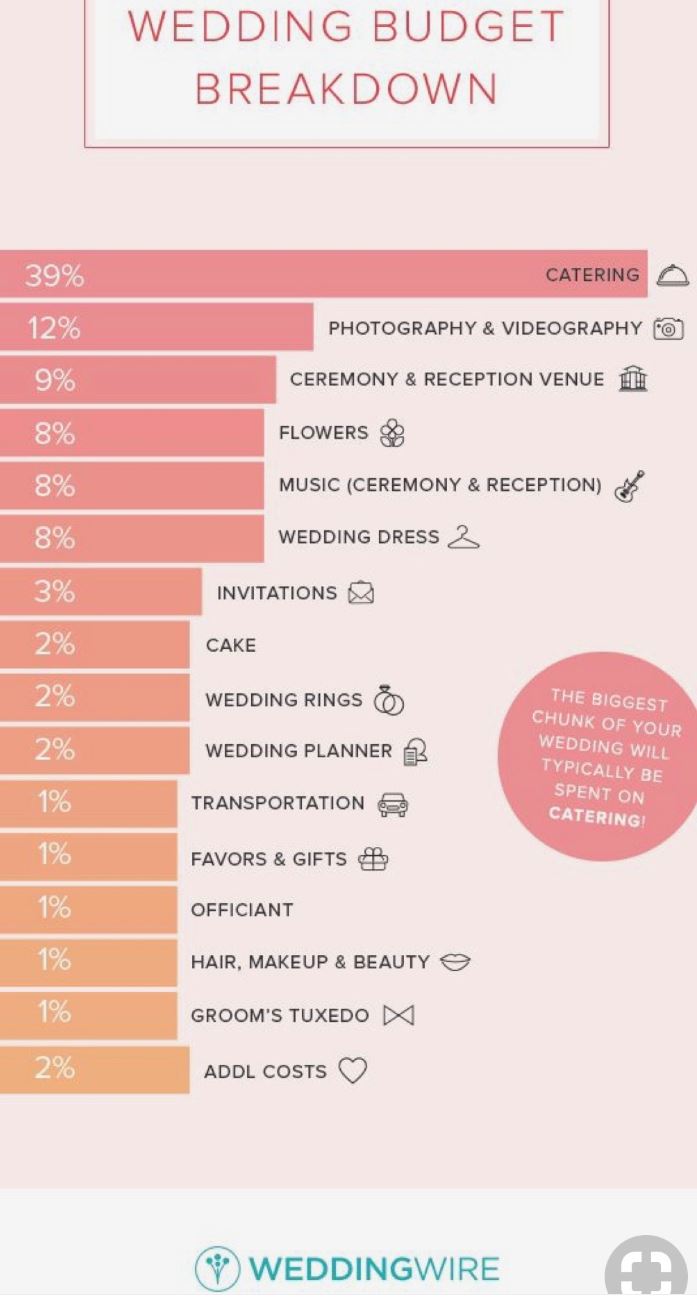 Similar with the previous graph, I’m not entirely sure why there’s a color scale. Maybe it’s there for the sake of aesthetics, but it doesn’t seem to serve a real purpose. Again, I feel that the graph would look better if the cost percentages were ordered from largest to smallest. Also, I’m not really sure why the 3% isn’t less than half the size of the 8% bar…there’s inconsistency throughout this chart when it comes the numerical values. One of the best pieces of advice Tableau offers aspiring chart creators has to do with the power of simplicity: “Unnecessary color does not add value. You should be able to justify every single color on your dashboard: why did you choose any specific color, and what does it communicate to your user?” This would’ve been a question best asked before the above color gradient was created. The following graph isn’t perfect (and it’s also from Wedding Wire) and it does use an unnecessary color scale, but I like how it broke down the variation as far as what *most* couples spend on a specific wedding item (cake) versus those with higher or lower budgets. The numbers make more sense than in the previous graph, and they provide greater context. 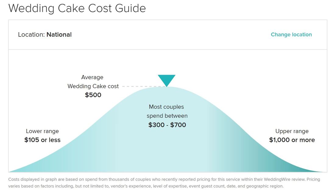
0 Comments
Leave a Reply. |
 RSS Feed
