 Perhaps one of the most overwhelming aspects about data and creating data visualizations is the amount of options one has when choosing how to represent statistics and numeric information in a compelling way. There isn’t necessarily *one* right type of graph or chart but nevertheless, one choice may be substantially more effective than another. In Chapter 2 of their book “Making Data Visual,” authors Danyel Fisher and Miriah Meyer address the challenge of “refin[ing] high-level questions into specific, data-driven tasks,” with the end goal being to create a “set of concise design requirements for a visualization tool that supports finding answers to those questions” (Fisher and Meyer, p. 9). By breaking down some public data in Excel, I have gained better insight as to what information is truly most important and how to share it. Socio-Economics Around the World Below, I’ve included a screenshot of data provided by the World Health Organization (WHO) (“World Health Statistics Socio-economic and Demographic”) indicating various socio-economic changes in regions around the world (such as population growth rate, fertility rate, literacy rate, school enrollment, gross national income per capita, and data regarding the number of a region’s residents that live under the poverty line) between 1995 and 2005: 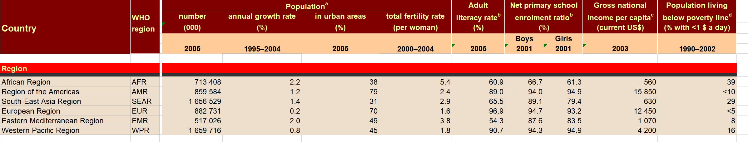 However, I only want to focus on a few of the numbers - specifically the number of people in each region in 2005, the growth percentage in population between 1995 and 2004, and the population growth in urban areas. That being said, here is a clean screenshot showing that information: 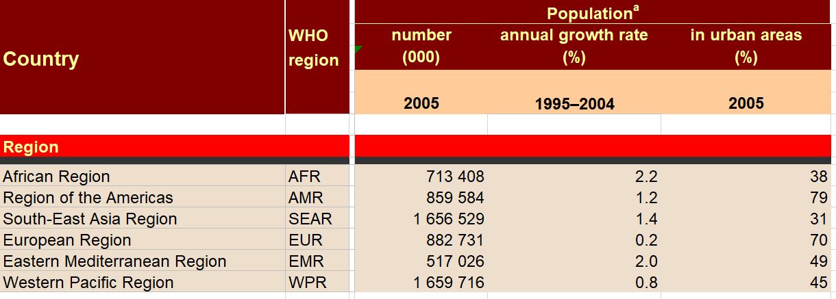 I believe the best way to present this data would be in the form of a global map. The regions on the map could be highlighted with different colors and filled with different shapes (i.e. polka dots or diagonal lines) to indicate an increase/decrease in population growth and the current population of residents in each place. Mortality by Disease Using information provided by the Centers for Disease Control and Prevention (CDC), I used Excel to input the number of deaths in 2016, percentage of total deaths, percentage change from 2015 to 2016, and the ratio of deaths by sex (this information can be found in full on page 6 of the report). 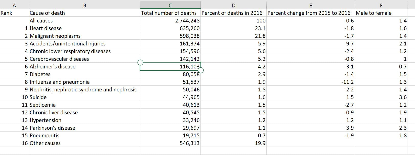 With this information, I’d want to explore which medical conditions affect more males versus females, get a concrete visual on what causes of death health-conscious people should be most wary of, and what causes of death seem to be seeing no improvement from year to year. For example, accidental injuries, Alzheimer’s disease, and Parkinson’s disease appear to be on the incline. I believe one of the best ways to present this data would be in the form of a line chart. Although this data only covers 2015 and 2016, it’d be interesting to see the rate at which certain diseases/causes of death impact the population over the course of a few years. There could be different colored lines for each cause of death so that the viewer could clearly see what health conditions (i.e. Alzheimer’s, suicide, etc.) seem most detrimental to society at a given time. We’d probably come to find that certain causes of death will ebb and flow over time while others continue to run rampant. Young Love For my third example, I tracked the number of child marriages (minors age 15 to 17) per 1,000 people in each U.S. state in 2014. This information was collected by researchers from the Pew Research Center who used supplementary data from the U.S. Census Bureau to come up with these numbers. As of 2014, it appears that nearly 58,000 minors between ages 15 and 17 were married, or about five teens per 1,000 people across the board. Here is a quick snapshot of the geographical data from the Pew Research Center: 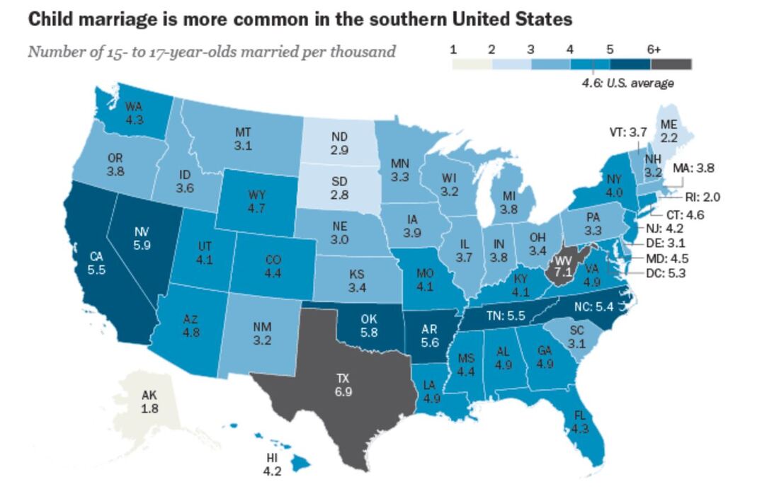 And here is the information I input into Excel: 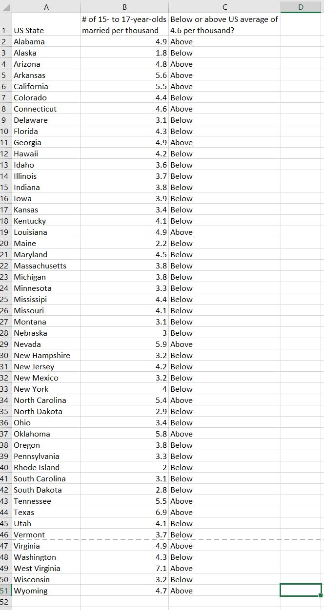 Pew Research already laid out the data in the way that I thought would be most effective - presenting the information geographically; state by state. However, another way the information could’ve been presented is through a vertical bar chart showing how each state’s number of child marriages varies, or two horizontal bar charts indicating a) the number or percentage of child marriages in each state and b) the percentage of females versus males that married young.
Using the information I have, I’d want to clearly see the shift in the higher number of young marriages in some regions (i.e. the Southern region/Bible Belt) versus states with less child marriages, and identify if states’ populations factor into this data. I’d also want to explore information that isn’t as obvious, such as whether or not the overall education, cultural perspective, history, etc. of each region may have had an impact on the number of child marriages in each respective state.
0 Comments
Leave a Reply. |
 RSS Feed
