 For someone who is not necessarily math or numbers-oriented, it came as something of a relief when Scott Berinato, author of “Good Charts: The HBR Guide to Making Smarter, More Persuasive Data Visualizations,” simplified the data visualization process as addressing two key questions: 1) Is the information being presented comprised of conceptual ideas versus data-driven information, and 2) Is the goal of the visual to confirm an idea or explore other ones? (Berinato, p. 54). Knowing the answers to the above two questions will then help data visualizers map out their data points. Berinato identifies four types of information visuals in particular: idea illustration, idea generation, visual discovery (confirmation and exploration), and everyday data visualization. Berinato describes idea illustrations as conceptual, declarative visualizations that “simplify complex ideas by drawing on people’s ability to understand metaphors and simple conventions.” (p. 58). In my opinion, this visual published to Medium is a simple but effective illustration showing how pyramid schemes work. It’s an effective visual because it doesn’t over-complicate the information presented. While the pyramid scheme visual is in fact, shaped like a pyramid, there is a clear, hierarchical structure, as readers are led from the base of the pyramid (where they learn about the recruitment aspect of the scheme) to the top (where they’re shown how the people higher up make their money). There are clear connections between the levels, and readers’ eyes are naturally drawn from the bottom upwards. 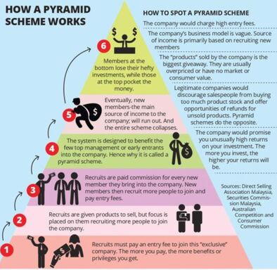 The idea generation visual is conceptual and exploratory. It is somewhat similar to idea illustrations, as they utilize metaphorical elements but are usually developed in brainstorming sessions or other collaborative environments (Berinato, p. 60). Idea generations can manifest in a variety of forms - sketches, brain dumps, and strategy sessions. Although the individual or group involved with the brainstorming may come to choose just one visual in the end, it’s likely that multiple visuals were created in the process. Berinato states that idea generation visualization often happens when the brainstormer is so inspired to come up with ideas, that he or she will write them down on a napkin (p. 60). Keeping this in mind, I used the following “Napkin Finance” example from design thinking company, OpenIDEO. 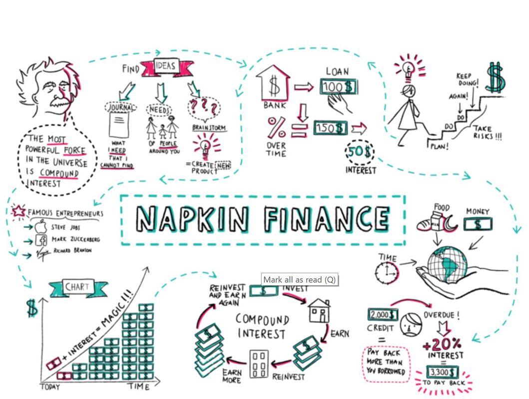 This image was the result of the illustrator coming up with ways to make better, smarter financial decisions. Not all idea generation visuals are as neatly laid out as this one, however, we do see a wealth and diversity of creative ideas for optimizing one’s financial situation, including visuals that illustrate the benefits of compounding, investing, lowering interest rates, and how these strategies will help one’s finances over time. Theses smaller sketches can pave the way for a more clean-cut, final visual. The visual discovery method is data-driven and can either confirm or explore in-depth a set of data. With visual discovery confirmations, Berinato writes that the visualizer aims to identify if the information being presented is rooted in truth, and how else the information can be viewed (i.e. finding out if the number of customer service calls went down because there were less issues with a product, or if customer service representatives were hard to reach). Visual discovery exploration, on the other hand, aims to use data to find ways to solve an issue. One interesting example I can think of that I believe focuses on visual discovery exploration is the following graph that was recently awarded by the Information is Beautiful Awards. “An Alternative Data-Driven Country Map” uses AI and machine learning tools to build connections between countries by clustering them based on a variety of factors including happiness score, healthcare, education, etc. Where there are gaps may indicate the areas in which countries do not share the same factors that equate to overall levels of happiness. (Click the link for a better view of the map) 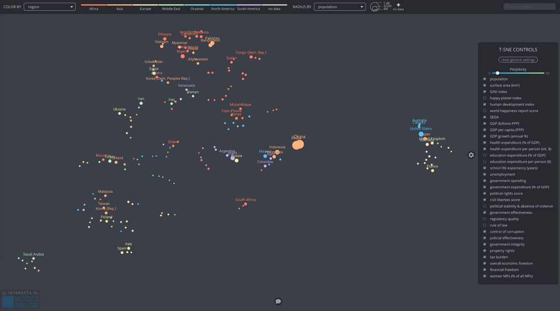 Lastly, the everyday dataviz visual embraces data-driven, declarative information. Berinato believes that these types of visuals emphasize simplicity, clarity, and generate discussion among the groups of people reading the chart presented (Berinato, p. 67). In short, the chart uses existing data to explain to readers information as we know it (i.e. a company’s revenue growth in a given year, amount of time spent on social media over time, percentage of data used over a month, etc.). This chart from Statista, for example, shows the most popular Instagram profiles by indicating the number of Instagram followers in millions as of May 2019. 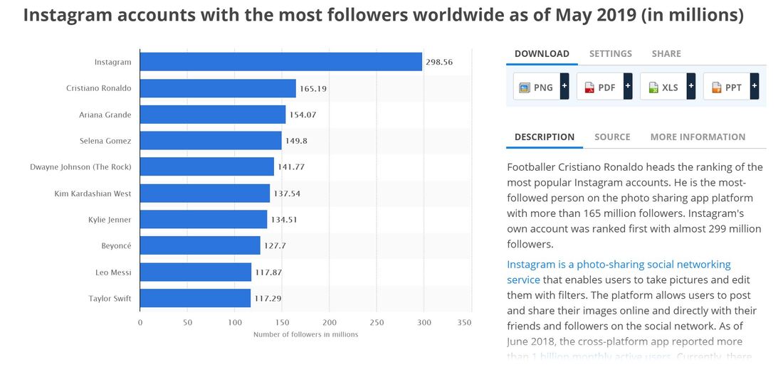
0 Comments
Leave a Reply. |
 RSS Feed
