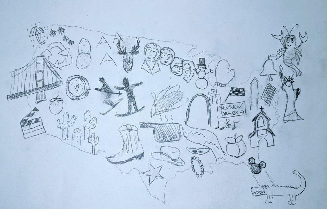
 The image I created for Part 1 of this assignment is what I would describe as a hand-drawn collage, the intent being to illustrate the most popular state landmarks, contributions, and perhaps even the stereotypes we Americans as well as non-Americans often think of when certain states and regions come to mind. It was my goal to create and manipulate the elements in such a way that one could make sense of the information presented and use it to mentally navigate what the U.S. regions have to offer so that the map “delivers value” to users (Interaction Design Foundation, 2019).
Admittedly, I am not the best artist, but hopefully my audience will think I have succeeded in highlighting some of the U.S. region’s best-known sites, commodities, and activities. For example, I included several famous historical sites, such as the Golden Gate Bridge in San Francisco, California, Mount Rushmore in South Dakota, the Gateway Arch in Missouri, and the Statue of Liberty in New York. I included produce as well, as exemplified by the potatoes of Idaho, Kansas corn, and the California orange (Maine is also famous for lobster, hence the lobster sketch on the far east side). I also added various activities that are popular in each state that many people tend to think of when those respective states come to mind, i.e. skiing in the Colorado/Utah areas, gambling in Nevada, Mardi Gras in Louisiana, DisneyWorld in Florida, the music capital in Tennessee, and the Indianapolis 500 in Indiana. Finally, I included some ‘stereotypical’ elements for some of the states, like rain in Washington, the recycling symbol for Oregon, cowboy elements for Texas, a crocodile for Florida, and a church in the Bible Belt region. Some benefits of the collage method? Ekaterina Walter and Jessica Gioglio, authors of “The Power of Visual Storytelling: How to Use Visuals, Videos, and Social Media to Market Your Brand” say that in the case of collages, more can be better, because multiple images may be able to say more than one standalone picture (Gioglio and Walter, 2014, pp. 44). They also make the argument that in industries where telling a compelling visual story is critical (such as branding, marketing, videography, and public relations), sticking with one, generic image may not cut it anymore: “In line with consumer photography trends, savvy companies understand that there’s more than one way to add a storytelling element on their social media channels through imagery. From traditional images to user-generated content, collages, images with text overlays, memes, and more, there’s a lot of creative potential for companies to tap into” (pp. 24). In short, rather than simply creating a map of the U.S. and writing out what each state is well-known for, or color-coding the map to show population density in the states, I felt that it was more impactful to provide a snapshot of what many of the states have to offer those who aren’t familiar with the U.S. Similarly in Ellen Lupton’s “Design is Storytelling,” she iterates the importance of creating images that not only capture, but hold onto viewers’ attention. Our eyes, in short, will often move towards elements that stand out the most or for one reason or another catch our eye. Lupton says, “Like a story, perception is active and temporal...Even when not confronting a specific task, our gaze gravitates toward points of interest, from eyes, mouths, and noses to snakes in the grass and letters on a page” (Lupton, 2017, pp. 116). I feel that based on what certain viewers find most interesting in terms of activities (i.e. skiing versus going to the rodeo), environment (i.e. Pacific Northwest rains versus the deserts of the Southwest), or landmarks (i.e. DisneyWorld versus the Liberty Bell), their eyes will be most drawn to those parts of the map. Lastly, in his report “Data Visualization, Data Interpreters, and Storytelling,” Hugh J. Watson shares on the importance of thoroughly knowing one’s audience when creating any sort of information visual, saying “The focus of storytelling is to capture listeners’ attention with a narrative that is supported by visualizations...Your listeners will ask themselves what the story means to them. Put yourself in their place when creating the story. Include specific, personalized examples that people will remember” (Watson, 2017, pp. 9). This was something I mused deeply while creating my U.S. map. Even though I have a fairly firm grasp on the colorful tapestry that makes up the United States, I wanted to give my viewers an understanding of it as well, as imagery can often be a universal language. Bibliography Gioglio, J., & Walter, E. (2014). The Power of Visual Storytelling: How to Use Visuals, Videos, and Social Media to Market Your Brand (1st ed., p. 24 & 44). New York: McGraw Hill. Information Visualization - A Brief Introduction. (2019, August). Retrieved from https://www.interaction-design.org/literature/article/information-visualization-a-brief-introduction Lupton, E. (2017). Design is Storytelling (p. 116). New York, NY: Cooper Hewitt. Watson, H. J. (2017, February). ResearchGate. Retrieved from https://www.researchgate.net/publication/316605154
1 Comment
Noah
9/20/2019 05:26:27 pm
Hi Caitlin, Leave a Reply. |
 RSS Feed
