|
The beauty of effective data visualization is that the eye can quickly digest the shapes, colors, and general movement of elements on a page and be able to absorb the bottom line of the information being presented. Data visualizations should be simple, uncomplicated, and uncluttered, especially since they are something we use every day. For example, we rely on Google Maps to provide easy-to-follow, up-to-date imagery and information to tell us where to go, just as we might rely on the instructional infographics presented in a pamphlet that comes with our new tech devices so that we can figure out how to set them up. In his report “Data Visualization, Data Interpreters, and Storytelling,” Hugh J. Watson iterates how more and more researches are gravitating towards increasingly creative ways of presenting information, as traditional methods can often lead to boring presentations, or ones filled with an overwhelming amount of data (Watson, 2017, pp. 8). He writes, “Storytelling can be used in many different settings with a variety of audiences...Stories can be used to explain or to help the audience explore a topic. Presentations should do more than identify a problem. They should suggest a resolution or at least lead to a discussion” (Watson, 2017, pp. 9). It’s one thing to be able to present numerical information in the form of a graph, pie chart, scatter plots, maps, and many other popular charts popular websites like HubSpot recommends. But charts aren’t one-size-fits-all. In fact, while the pie chart is one of the most commonly used infographics, it is not always the most effect chart to use because it is only able to measure pie-sized slices of percentages, i.e. 50%, 75% and so forth (HubSpot, 2019). It can also be easy to get lost in the numbers of a data set, especially for those who don’t necessarily consider themselves ‘analytical thinkers.’ Perhaps that is one of the reasons why I find the work of visual storytellers like Sarah Illenberger and Peter Grundy so fascinating - they prove that a compelling, well-executed visual can convey the core of a message without having viewers get lost in the weeds of numerical information. In the case of Illenberger, she relies on everyday household items to help illustrate her research, such as tissues, clothing, vegetables, and a cactus to represent people’s sexual behaviors (Sarah Illenberger, 2010). Although the concept of gathering data, as well as making it visually appealing, may sound daunting, the result shouldn’t be one that also confuses viewers. It should simplify the process. The author of the Interaction Design Foundation article, “Information Visualization - A Brief Introduction” iterates that the goal of data visualization is to communicate in imagery what is difficult to explain in mere words. However, one must be careful not to fall into the trap of bias, or limiting the information shown in an image to ‘prove’ an agenda: “There is a ‘dark side’ to the presentation of information for understanding and it’s the presentation of information to persuade...It is up to the presenter to decide where the ethical boundaries are in persuading people through information visualization.” The following is my version of a creative representation of qualitative data. Using the vegetables I happened to have in my refrigerator, I used carrots, celery, and mushroom slices to symbolize the rough estimates of food insecurity in the United States between 2016 and 2018 (data gathered from the United States Department of Agriculture Economic Research Service). The celery represents the states experiencing with food insecurity below the U.S. average, the mushrooms symbolizes states where food insecurity is near the U.S. average, and the carrots represent states where food insecurity is above the national average. As a reference, the national average of food insecurity is set at about 11 percent of U.S. households per state (chart data accessible here). 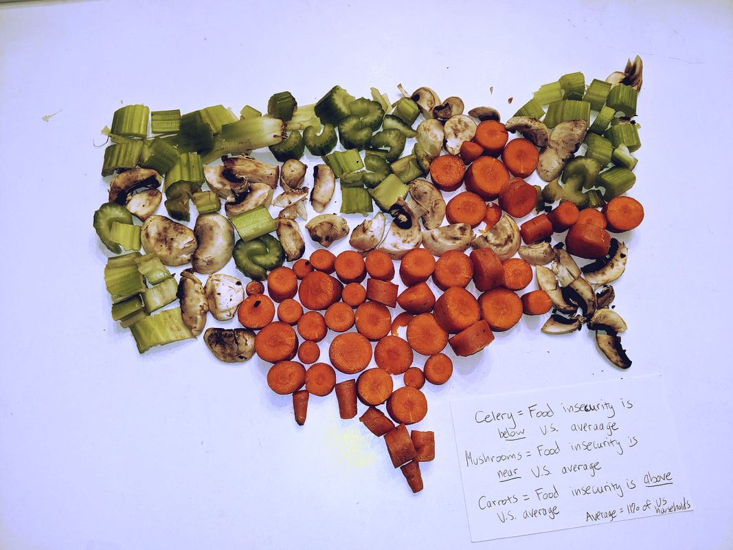 Bibliography
Coleman-Jensen, A., Gregory, C. A., & Rabbitt, M. P. (2019, September 4). Food Security in the U.S. Retrieved from https://www.ers.usda.gov/topics/food-nutrition-assistance/food-security-in-the-us/key-statistics-graphics.aspx#map Data Visualization 101: How to Design Charts and Graphs. (n.d.). Retrieved from https://cdn2.hubspot.net/hub/53/file-863940581-pdf/Data_Visualization_101_How_to_Design_Charts_and_Graphs.pdf Illenberger, S. (2010, October 5). Sarah Illenberger's Infographics. Retrieved from http://allmyeyes.blogspot.com/2010/10/sarah-illenbergers-infographics.html Information Visualization - A Brief Introduction. (2019, August). Retrieved from https://www.interaction-design.org/literature/article/information-visualization-a-brief-introduction Watson, H. J. (2017, February). ResearchGate. Retrieved from https://www.researchgate.net/publication/316605154
0 Comments
Leave a Reply. |
 RSS Feed
