|
Perhaps it is a prominent part of American culture, or perhaps it permeates into most social situations but it seems that part of the human experience is frequently saying one thing while meaning another. For example, saying “Interesting” in response to someone else’s commentary about their day doesn’t usually mean that that person actually found it interesting. In fact, it probably means the opposite. Images can do the same thing; they can seem to say one thing while getting a different or opposite reaction from viewers. This could be done intentionally (which is common for marketing purposes), or it could be because the goal, objectives, and perspective of the designer is different from that of the person seeing the image for the first time. In their article “Designers and Users: Two Perspectives on Emotion and Design,” authors Donald A. Norman and Andrew Ortony make the point that there is often a “mismatch” between the perspective of the designer versus the perspective of the user. They argue: “Differences between designer and user perspectives of the same product are particularly evident with respect to the role of emotions. The designer may intend to induce emotions through the design, but because emotions reside in the user of the product rather than in the product itself, the emotions the user experiences are not necessarily the same as those intended by the designer” (Norman and Ortony). They go on to say that while designers, artists, and creators have the opportunity to instill emotions in those who view their work, thereby having a possible impact on how viewers react, this influence only goes so far. It will ultimately be up to the viewer how he or she will be moved by an image. In Ellen Lupton’s “Design is Storytelling,” she references usability expert Donald Norman’s division of the user experience into three phases: visceral, behavioral, and reflective. Through the visceral process, we quickly process what we see - color, texture, form, etc. We can process this information through our behavior as well - does the image compel us to buy a product or service, read more information about it, and so on? Lastly reflection occurs as we remember what emotions with connect to that image we first saw (Lupton, 2017, p. 64-65). Lupton writes: “Emotions are often what move people to use a product...Products can move users from one emotional state to another. An exciting story is a winding path of uncertainty and revelation. A story’s emotional arc shifts over time. Designers use color, light, texture, and sound to modulate the mood of a product, service, or place” (Lupton, 2017, p. 65). All this to say, images can portray and convey emotions, and they need not always be the same emotion. A Picasso painting from his Blue Period expresses the depression he felt at the time even though at first glance, we might assume the bright blue hues are meant to show vibrancy. Likewise, an upbeat song that a popular band performs might reveal a sobering message lyrically. Below, I have included three images that I feel express one emotion while instilling another in viewers: 1. “Romeo and Juliet” (1968) 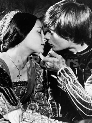 This is a still from the 1968 film version of “Romeo and Juliet.” Because we all know how the story goes, we know that this sort of imagery is supposed to convey romance, love, and passion - and it does. We can tell by how close the two star-crossed lovers are positioned (proximity), the closed eyes, and the tender finger resting on Juliet’s chin. Aside from the fact that we know how the play ends (not well for the titular characters), the emotion we might feel instead of love and awe is one of sadness and grief because we know their fate and may proactively be grieving for their deaths. It almost looks like the couple knows this could be their last kiss. Additionally, the black and white effect makes the image look like something you might find in old family photo albums (which of course is silly, since there wouldn’t have been photographs during this time period); as though we’re looking at happier times. 2. BBC’s “Sherlock” 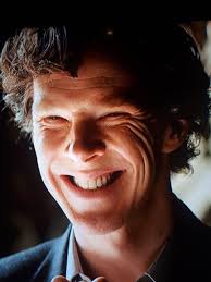 This is meme-worthy image of BBC’s Sherlock making this cringe-worthy face is supposed to be a (feigned) pleasant expression to another character but comes off as a bit creepy for those of us watching. I can’t quite remember exactly what was happening in this scene, but I think I can recall Sherlock making a point during an argument that he probably wins. Using Plutchik’s taxonomy of emotions (Lupton, 2017, p. 61), I would argue that the face Sherlock is trying to make is one of optimism (one of the many emotions he doesn’t show because of his sociopathic tendencies), as indicated by the weird smile and squinted eyes but what we feel is annoyance because it doesn’t seem sincere. 3. “Afghan Girl” by Steve McCurry 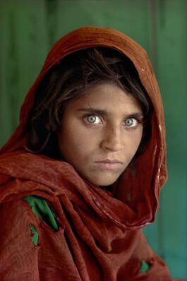 Perhaps one of the most iconic photographs in history, Steve McCurry’s “Afghan Girl” balances opposing emotions simultaneously. Knowing the context behind the image (it was taken at a refugee camp), we know that the girl’s surroundings are bleak. Though she is a young girl, we can see that she has had to grow up fast in her environment, and the ripped clothing and dirt smudges hint at a rough upbringing. The emotion of the photograph is one of rawness, realness, and using the Plutchik emotion wheel, sadness and grief. But the brightness of her green eyes has made an impression on people around the world who have seen this image - our emotion is amazement. The vibrancy of the colors in this photograph almost seem to betray the actual mood of the story behind the photograph. Jerry Cao writes in his article “Web design color theory: how to create the right emotions with color in web design” that the color red tends to symbolize power and youth. He says, green, on the other hand, “bridges the gap between warm and cool colors, though tends to be more of a cool color. This means green has the same relaxing effects of blue but still retains some of the energizing qualities of yellow.” Bibliography Cao, J. (2015). Web design color theory: how to create the right emotions with color in web design. Retrieved September 7, 2019, from https://thenextweb.com/dd/2015/04/07/how-to-create-the-right-emotions-with-color-in-web-design/ Lupton, E. (2017). Design is Storytelling (p. 61-65). New York, NY: Cooper Hewitt. McCurry, S. (Photographer). (1985) Afghan Girl [photo] Norman, D. A., & Ortony, A. (2003). Designers and Users: Two Perspectives on Emotion and Design. Retrieved September 7, 2019, from http://projectsfinal.interactionivrea.org/2004-2005/SYMPOSIUM%202005/communication%20material/DESIGNERS%20AND%20USERS_Norman.pdf Gatiss, M., Moffat, S., Thompson, S., Vertue, S., McGuigan, P., Lyn, E., Lawes, S., ... Public Broadcasting Service (U.S.),. (2010). Sherlock: Season three. Zeffirelli, F., Shakespeare, W., & Paramount Home Video (Firma Comercial : Estados Unidos). (1968). Romeo and Juliet. Hollywood, CA: Paramount Home Video
0 Comments
Leave a Reply. |
 RSS Feed
