 RSS Feed
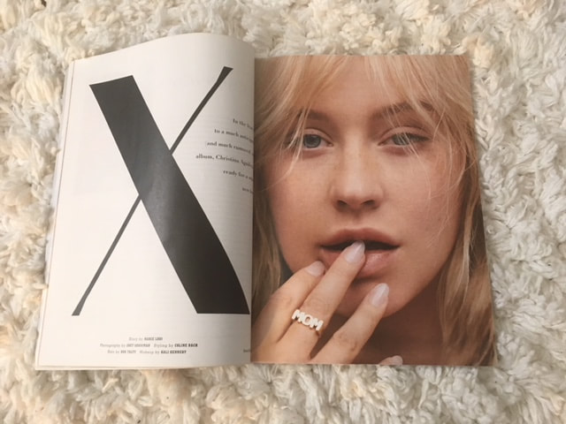 For this week’s assignment, I compare the web version of the Spring 2018 edition of PAPER Magazine with the physical hard-copy. Here is the cover page of the paper PAPER magazine: 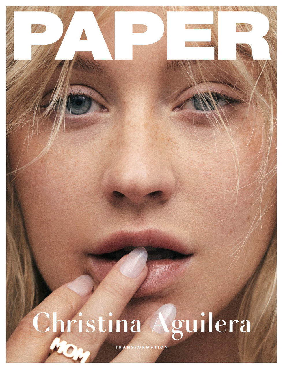 Image by PAPER Magazine The cover story has to do with (yet another?) artistic transformation of the singer-songwriter Christina Aguilera. Her au natural face comprises the entire front cover, save for the tiny white margins. There are no other magazine stories highlighted on the cover; the word “PAPER” is superpositioned over her forehead and her name is holding down the fort at the bottom edge of the magazine. If you proceed to page 26 where her story begins, a very modern font is used for the letter “X” (often used to denote Aguilera’s name; “Xtina”) while the rest of the story uses a thick sans serif font (save for the pull-quotes that utilize the modern font again). Additionally, it appears that the tracking across all the words makes them appear more spread out with plenty of space separating each word. From page 26 to where her story ends at page 40, the layout utilizes a two-column format (at least on the pages where various images of the musician aren’t covering entire pages). However, it is important to note that while the two-column format is used, there aren’t alway words appearing in both columns, and the words appear to be left-justified with no indents. In fact, the article leaves almost half-pages empty, leaving some of the pull-quotes to hang in the air and make more of an impression on readers. Although I might not have thought of laying out the design in this way, I think it is a good use of white space. This strategy follows one of the layout rules Kim Golombisky and Rebecca Hagen outline in Chapter 4 of the book “White Space Is Not Your Enemy.” They describe “trapped space” to a trapped bubble that can’t escape, (Golombisky and Hagen, 2017, p. 40) however, the designers behind PAPER Magazine avoid this by pushing the extra negative space to the outside of the layout.  The web version of PAPER Magazine, however, uses a different kind of font, a more web-friendly font that is a bit easier on the eyes - Lato. And rather than a modern type of font being used to denote significant quotes or aspects of the cover story, a boldened/thicker Sans Serif font is used (link here so readers can follow along: http://www.papermag.com/christina-aguilera-transformation-2553214651.html). 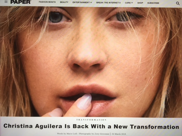 Unlike the paper version of the story, Xtina’s full face isn’t featured right away; it’s partly cut off by words where the story begins (although if you scroll down a bit, a screenshot of the paper cover appears in the article). The web version lays out the story in one column and like the magazine version, everything is left-justified with no indents. The pull-quotes, however, are centered. One of the other main differences is that the web version allows viewers to choose what images of Xtina they want to enlarge since all the images don’t appear in their full size as they do in the physical copy.
Bibliography: Golombisky, K., & Hagen, R. (2017). Layout Sins. White Space Is Not Your Enemy: A Beginner's Guide to Communicating Visually Through Graphic, Web & Multimedia Design (3rd ed., pp. 33-44). Boca Raton: Taylor & Francis. Lodi, M. (2018). Christina Aguilera Is Back With a New Transformation. Retrieved February 9, 2019, from http://www.papermag.com/christina-aguilera-transformation-2553214651.html Lodi, M. (2018), Christina Aguilera Transformation. Paper, 34, 26-40.
0 Comments
Leave a Reply. |
