 RSS Feed
 In any culture where language is communicated via writing, we know that understanding takes place when one knows the meaning behind each symbol. In English, the “A” shape notes the beginning sounds of words like “apple,” “adolescence,” and “aptitude;” in Hebrew the chai symbol (the one that looks like pi) denotes “life,” and we know from our basic understanding of ancient Egyptians, much of their written communication we see in hieroglyphics.
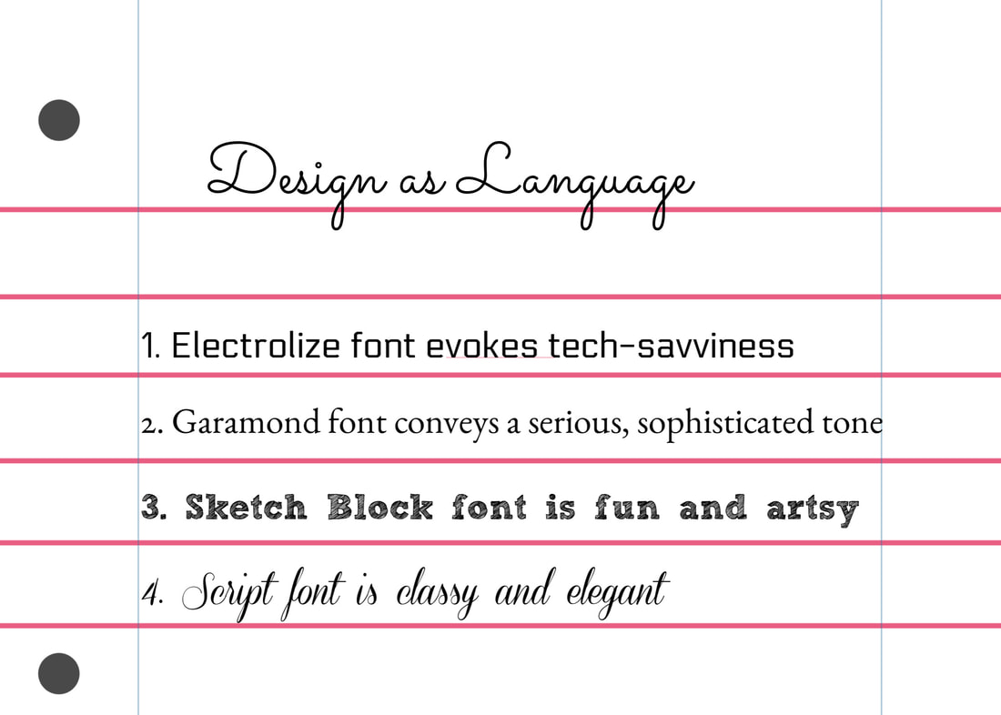
Through my reading and hands-on work in Module 2, I’ve come to better appreciate and understand design as a language as well. It is up the the designer to use their art tools and knowledge of design principles to effectively communicate their message and it is also up to the viewer to understand what is being said through an image. In the Printing Code article “Basic Shapes and Relationships,” the author uses the word “Danger” as an example for how the illustration of this word can be manipulated to mean different things. When the word “Danger” is written in Comic Sans text in a bright color (one that isn’t red), it might be difficult for someone to take the word “Danger” seriously. It is for this reason that our U.S. stop signs are colored in red and the word “STOP” is written in all caps -- the red color tends to stand out from the usual color of our surroundings (i.e. green trees and grass, and the dark color of the road ahead), causing our brains to pay attention to the brightly-colored traffic sign. Even rudimentary stick figures placed on signs warning drivers to look out for cyclists and pedestrians stand out in our brains, quickly capturing our attention and reminding us that we’re not the only ones using the road. Even the placement of shapes can convey a message about a design. A shape that is tilted, seemingly hanging in the air can come across as whimsical, while a solid-colored image placed at the bottom of a canvas might be deemed more serious. An image with distinguishing features that is placed where it stands out from the other objects may make it the focal point of a design, while an object placed in a more hidden area might be interpreted as a supporting character of sorts. These principles are true of a design’s text as well. In the textbook “White Space is Not Your Enemy” by Rebecca Hagen and Kim Golombisky, the lines that comprise text/font convey personality. The authors write, “...the line is associated with movement and eye flow. And, if we recognize that a layout in its entirety forms a unified picture of sorts, when we also can use lines in layout to control the eye’s movement in order to convey information, as well as evoke emotion” (Golombisky and Hagen, 2017, p. 48). Some popular text fonts that come to mind as I ponder this principle are fonts like Bookman Old Style or Garamond, which tend to evoke a sense of high intelligence and literacy. Handwriting or script style fonts are elegant, while Comic Sans seems more cartoonish (and is often the butt of many writers’/creative people’s font jokes). All this is to say that just as form follows function, the elements of design - space, line, shape/form, size, color, texture, focal point, contrast, balance, unity, pattern, movement, proximity, closure, continuity and so forth (Golombisky and Hagen, 2017, p. 46) - must convey the correct message. Both the image and the distinguishing features of an image must be consistent with the designer’s overall goal. Bibliography: Basic Shapes and Relationships. Retrieved February 2, 2019, from http://printingcode.runemadsen.com/lecture-form/ Golombisky, K., & Hagen, R. (2017). Mini Art School. White Space Is Not Your Enemy: A Beginner's Guide to Communicating Visually Through Graphic, Web & Multimedia Design (3rd ed., pp. 46-48). Boca Raton: Taylor & Francis.
0 Comments
Leave a Reply. |
